The Message is Medium Rare

The Message is Medium Rare

  • Burgers
  • Index
  • About
  • Facebook
  • Digest
  • Press

No. 15: Raising the Bar

$16 at Bar Jules
April 16, 2014 by Christopher Simmons in ★ ★ ★ ★ ★

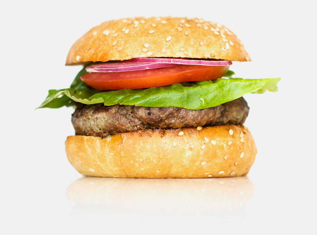
★ ★ ★ ★ ★ Bar Jules offers a stunningly confident, stridently minimal, deliciously simple burger. The patty is a blend of 70% lean muscle and 30% fat, butchered and ground from local grass-fed livestock. The flavor is remarkably complex, presenting an almost gamey aroma and a rich, earthy flavor with traces of smoke and salt. Except for the air and earth of the Marin Sun Farms rangeland on which it was raised, the meat is otherwise unseasoned.

The bun is airy but firm. I’m not sure what else to say about it but that it was sliced in two, dabbed with a little olive oil, and toasted on the grill. The blackened edges deliver a pleasing crunch. A judicious spread of house-made aioli adds a Provençal twist to the ensemble. 

That, my friends, is the totality of the Bar Jules burger. Aside from the aioli it comes undressed—though small dishes of ketchup and mustard are provided by request. We added the latter. There is no lettuce, but the burger is served beside a “little salad.” It too is exceedingly simple, consisting only of lettuce and tossed with a dressing of (I’m guessing) olive oil, lemon juice, and diced capers. It has a clean, acidic bite that pairs brilliantly with the savory meat. 

Improbably, the Bar Jules burger is one of the best I've ever tasted. It is the ultimate commitment to culinary minimalism—unfussy, undecorated, unassuming, uncompromising and unashamed of its nudity. It has no tomato, no pickles, no onions, no cheese, no fries, and it makes no apologies. It’s just meat. Period. On a bun. Period. Any questions?


The Creative Lesson

Simplify. Our Studio is governed by a simple design philosophy: find the simplest possible solution, which is also interesting. Though many strive for it, many designers are also scared of simplicity. Simplicity requires clarity—not just of expression, but of content and of purpose. It requires identifying the most important thing, dissecting it, considering it from multiple perspectives, and rebuilding it into a more essential and more elegant version of itself. It is the marriage of conceptual purity and impeccible craft. There is no room for error, no ornament behind which to hide.

The Bar Jules burger is unequivocal in its commitment to this ethos—a commitment which is supported by quality content and expert execution. It is a kindred spirit in all I strive for in design.

NB: Nathan gives the Bar Jules burger three stars. We also disagree sharply on Umami Burger, which will be the focus of the next review. Stay tuned for a bonus post exploring the distance between our divergent opinions.
April 16, 2014 /Christopher Simmons
★ ★ ★ ★ ★

No. 14: A Shallow Dive in Deep Ellum

$7 at Adair's Saloon
April 11, 2014 by Christopher Simmons in ★ ★ ★

★ ★ ★ I’ve learned a few things since starting this burger blog. One of them is that everyone has an opinion about what constitutes the best burger, and where to get it.

When I let slip that I was in Dallas this week, the recommendations came flying. The much hailed Liberty Burger was cited by both friends and readers, as was Wingfield’s, the wonderfully-named goodfriend, and the alliterative Maple & Motor. The nice gentleman who picked me up from the airport also had a few suggestions including Whataburger, a Southern chain that has stayed miraculously true to its 50’s roots.

Speaking of roots, Twisted Root was another recommendation. And as it came from a friend, I decided to make that my Dallas burger experience.

Twisted Root’s website proclaims, “Our philosophy is that the best burger in the world is in a dive down the street...and that’s just where we are.” (Not many dives boast a website, but I agree with the sentiment). Open since 2005 in the lively east Dallas entertainment district known as Deep Ellum, Twisted Root exploded after Guy Fieri profiled them on his show in 2009. Today they have ten locations...and franchising opportunities. Can you franchise a dive?

Twisted Root's menu offers more than a dozen different types of meat (beef, buffalo, venison, elk, lamb, ostrich, kangaroo, emu, boar, alligator, rabbit, camel and beaver) on your choice (mostly) of three different buns, with seven different cheeses (is nacho a kind of cheese?) and toppings ranging from prosciutto to peanut butter. Inside, the decor consists largely of distressed signage—some repurposed, some with an apparently applied patina—corrugated metal, and a few rogue stickers strewn about. Outside a sign proclaims, “Where The Locals Eat.” 

“No they don’t,” confided my friend Jeremy, who drove me down to Deep Ellum and whose love of a good cheeseburger rivals my own.

“No?” I asked, “Then where do the locals eat?”

“Right across the street.”

I followed Jeremy away from the peanut butter beaver burger and down an alley toward the back door of Adair’s Saloon. Adair’s is a dimly lit 40-year-old honky tonk bar with a shuffleboard table and a live stage. Every inch of the place is covered with messages, jokes, signatures, drawings and doodles scrawled in sharpie marker by appreciative patrons over the years. In front, stickers black out the street-facing windows. Whenever someone walks in (or stumbles out) a bright shaft of light pierces the dark space with mysterious purpose. 

Adairs_Saloon

They have three mainstream beers on tap—Miller Lite, Dos Equis, and the ubiquitous local favorite, Shiner. They also have a trio of craft brews on draft, including Angry Orchard Cider, Velvet Hammer from Peticolas Brewery (props to Peticolas for dedicating an entire page on their website to the design of their logo—no mention of the designer though), and Temptress, an imperial milk stout from Lakewood Brewery in Garland (props to them for nice typography). I opted for the Temptress on the bartender’s advice: “It’s 9% alcohol.” 

When it comes to burgers the options are more limited: hamburger or cheeseburger. We each ordered the cheeseburger—a thick half pound of unseasoned meat, slow grilled to medium rare. I split mine with my friend Brandon who showed up as soon as he heard he were heading to Adair’s. Jeremy told me the grill is so old that slow grilling is the only option. They also grill their fries which makes them a little crisper than your average french fry.

Burgers in Texas come with mustard. Ketchup is strictly for the fries. At Adair’s they also come with the basic lettuce, pickle and onion setup, plus a big fat jalapeño speared to the top. That pepper is hot, by the way, so order yourself another beer before taking a bite. The bun is tasty enough—nothing fancy, but that’s just fine since there’s nothing fancy about the rest of the burger. It’s just a really tasty, really hot, really real burger. Maybe that’s because Adair’s is a real dive.


The Creative Lesson

Show Don’t Tell. One of the first choices a brand has to make is whether to show or whether to tell. Twisted Root was all about telling. This is where the locals eat. We are a dive bar. Arguably their strategy has worked. After all, they own nine locations and a franchise. But they are sanitized facsimilies of a dive bar—all copies of a copy. Now people drive from all over to line up to eat where the locals eat, but across the street the locals are eating at Adair’s.

I know it’s hard to make an argument against success—especially commercial success. Twisted Root is a successful and studied simulation of an original experience—perhaps even the Adair’s experience. It does a fine job of talking the talk and clearly enough people like what they hear. Adair’s, on the other hand, is walking the walk. In the strictest sense they are the stronger brand. It is a paradox, to be sure, but the world needs more originals and fewer copies.
April 11, 2014 /Christopher Simmons
★ ★ ★
Salut Ya Burger, Kyoto, Japan

No. 13: House of the Rising Bun

¥900 at さるぅ屋
April 04, 2014 by Christopher Simmons in ★ ★

★ ★ Nathan is on vacation in Japan, but of course we put him to work. He emailed me this review of a Japanese take on the American classic:

Hey Christopher,

I just left Kyoto. I had a burger while I was there. In retrospect, Kyoto was probably a strange place to seek out a burger; famous as it is for being the stronghold of everything traditionally Japanese. Then again, perhaps that’s a fine enough reason so long as you don’t hope for anything too familiar.

I have given up on hamburgers as an antidote for homesickness. In rural China, near the Tibetan border, I once ordered a hamburger but was served instead a steak of gristly yak meat between two thick slices of toast. What a disappointment. There is simply too much nostalgia built into a hamburger. How wonderful would it have been to have ordered a yak steak sandwich and received a yak steak sandwich? When abroad I think it is best to keep one’s hamburger expectations low.

So we rented bicycles and rode out to a small cafe called Salut Ya. It is located in a renovated old machiya (townhouse) and I heard is famous for it’s burger.

I ordered their cheeseburger. What arrived on my plate appeared to very nearly be a classic cheeseburger. All the usual elements were stacked in place: bun, lettuce, tomato, grilled onion, melted slice of cheese, beef patty, bun. But the burger arrived cut in half like a deli sandwich. A pair of toothpicks kept each slice intact. The grind was dense and devoid of grease, juiciness, or attitude. The bread dominated. It was a round (very round) sesame-encrusted baguette— puffed up like a rotund caricature of a bun.

There was, however, one inspired moment in Salut Ya’s burger.  It occurred at the crossroads of its most misguided elements: the patty that was too dense and the bun that was too bready. The diameter of the patty was just narrower than the diameter of the bun. This offset allowed it to be pressed slightly into the soft spongy part of the bread, such that it was encased by the lip of the crusty part. Sadly, this clever feat was made possible by the two elements that were least satisfying.

To be honest, the meal was not unpleasant, so long as the memory of a cheeseburger didn’t crop up. Because what looked like a classic cheeseburger was more of a beefy hamburger-inspired sandwich. Looked at this way, it was a hell of a lot better than yak.

Cheers,

Nathan


The Creative Lesson

Get the big things right before you get the small things right. There’s no point in kerning a headline before you've settled on what the message is or refining a sketch before you’ve heard the brief. Starting with the small things can lead to the false assurance that a problem has been solved, when in fact that problem was a false problem. As in the case of this burger, the delightful detail of the meat seated into the bun did nothing to resolve the bigger issue of taste.
April 04, 2014 /Christopher Simmons
★ ★

No. 12: Honest to Goodness

$17 at Magnolia Gastropub Brewery
March 28, 2014 by Christopher Simmons in ★ ★ ★ ★

★ ★ ★ ★ At the corner of Haight and Masonic, just one block from San Francisco’s most famous intersection, you’ll find the magnificent Magnolia Gastropub Brewery. Inside you’ll find one of the best regularly available burgers the City has to offer.

At $17 the Pub Burger is on the pricier side, even for San Francisco. Add cheese, bacon and an egg and your tab runs north of $20. Fortunately, the lettuce, tomato and red onion come standard. Although we normally bless our burgers with slice of American or cheddar, we had ours as it comes (medium rare, of course) and didn’t miss the cheese. The hand-formed, Prather Ranch patty may be the freshest I’ve tasted. It has a coarse grind and plenty of fat. Ours were generously proportioned and cooked to a perfect 130˚. The Acme bun performed well against an onslaught of juices, with just the right balance of softness and firmness. I thought it was a little too much bread to go through to get to my burger, but Nathan felt it was well-balanced. Magnolia makes its own mustard and aioli, both of which I recommend. A word of caution: the beer mustard has a strong flavor and pungent aroma; administer it judiciously or risk overpowering your burger.

Clearly this is a first rate burger. We’ve called it one of the best. We’ve described it as “perfect.” It’s been recommended to us by more than a dozen readers, not to mention friends, colleagues, and anyone who knows we’re on the hunt for a great burger experience. So why only four stars? What could possibly be done to make it better? Magnolia makes a really, really good burger. It’s just not a great burger. It’s not a burger you’ll bike across town for on a Sunday afternoon. It’s not a burger you’re going to insist your out-of-town relatives have to try when they come visiting. Why not?

That’s the question we found ourselves pondering over today’s lunch: What’s the difference between good and great? Individually, every element of Magnolia’s burger was excellent. Together, though, they never achieved that alchemy that makes something exceed the sum of its parts. Why this is is a bit of a mystery, but if you’ve ever been in love you know what I mean. Either the spark is there or it isn’t. 

The atmosphere at Magnolia is a carefully crafted pastiche of British pub style. The dark wood, black-leather-upholstered booths draw you into the space and away from the funkiness of the neighborhood outside. The once regular pattern of floor tiles has long since deferred to seismic influences. Mirrored columns at the bar cast little reflection through their ancient patina. Great portions of ceiling paint peel and blister above us. Though authentic, one has the sense that these proudly historic elements have been preserved, curated and encouraged. And it’s a nagging sense. Similarly, the menus are designed to look reclaimed and reassembled. Though the typography on the cover of the menu is delightfully eclectic, inside I think it tries a bit too hard with its overuse of Regula—a transitional typeface whose pre-distressed ‘Old Face’ option feels more the domain of treasure maps than menus. 

Above the famously grateful bar one wall is painted with a faux gold finish, obscuring (I would later learn) a mural of Jerry Garcia. And maybe that’s the clue. Magnolia is peculiarly at odds with its location—a brooding hipster surrounded by aging hippies, skaters, weekend runaways, and the tourists who come to see them. It eschews its funky surroundings for a darker kind of romance—an effort that does not go unnoticed. Here again, it’s the noticing that matters. Every designed experience relies on a degree of veneer, but there is an element of artifice to Magnolia that doesn’t let you fully devote yourself to it. It’s the nuanced difference between good and great; between loving and being in love.


The Creative Lesson

Keep it real. Designers talk a lot about authenticity. Usually it means we want to create honest messages in an honest way, and that we want our clients to run businesses that are true to their vision and values. A big part of this is about integrity. Another big part is about effort. When you make too much of an effort to ensure your customers see your business the same way you see it messages can feel forced. Your efforts disingenuous. For the record, I don’t think this was a huge issue at Magnolia. The food was excellent. Our server was friendly and well informed. But being finely attuned to the tiniest details of the burger-eating experience, this authenticity gap was—for us—distance between good and great.
March 28, 2014 /Christopher Simmons
★ ★ ★ ★

No. 11: A Machine Made of Words

$6 at Rosamunde
March 20, 2014 by Christopher Simmons in ★ ★ ★ ★ ★

★ ★ ★ ★ ★ Meet our first five star burger, courtesy of Rosamunde.

In his introduction to The Wedge the poet William Carlos Williams writes, “There’s nothing sentimental about a machine...A poem is a small (or large) machine made of words. When I say there’s nothing sentimental about a poem I mean that there can be no part, as in any other machine, that is redundant.” This describes perfectly my feelings about the cheeseburger at Rosamunde. It is an exacting harmony of flavors and textures—a formal invention made of familiar parts but resolved into something exquisitely new. 

The bun—something between an english muffin and an onion roll—is surprisingly pleasing given its density. Charred and crispy around the edges and glutinously chewy at its center, it has the fortitude required to support the nearly half-pound patty all-beef patty. The patty is a hefty, gas-grilled affair. Its skin is seared. Its flesh is hot. Its heart is perfectly pink. The meat is lightly seasoned, but picks up a deliciously honest flavor from the grill. Rosamunde dresses their burger with a generous slab of cheddar and modest servings of lettuce, pickles, tomatoes and onions, the latter of which are scraps from their primary business—sausage making. The onions are grilled just short of translucent, striking the perfect balance between tender and crisp. Foreshadowed by the onion-dotted bun, the grill-sweetened onions complement the tartness of the pickles—the final cog in a finely-crafted machine.

Despite the sausage maker’s four locations (two in San Francisco, one each in Oakland and Brooklyn), the Rosamunde burger remains elusive. They only make cheeseburgers, only serve them at their Haight Street location (and only Tuesdays), and only make 200 of them. The restaurant only has five seats, but you’re welcome to enjoy your lunch next door at the Tornado Bar.

Three people work the tiny kitchen. One rings up orders, one does nothing but grill, a third does nothing but assemble. Each approaches their task with singular dedication. The cook is rigorously attentive to his patties but with jazz-like improvisation, making constant tiny adjustments that seem rooted more in intuition than precision. The builder dresses each bun with focus and flourish, creating rows of nearly identical but distinctly individual burgers-in-waiting. There’s no denying the efficiency of the operation, but the motives seem based upon expertise rather than just expediency. Like the burger, the kitchen is a great complementary machine—each element a small but essential part of a larger whole.


The Creative Lesson

Specialize. In design there are specialists and there are generalists. One of the reasons that Rosamunde’s burger is so excellent is because it is the sum of specializations. Each part—whether an ingredient, a technique, a technician or an artisan—plays a small but critical part. I’ve watched a lot of people make a lot of burgers and I’ve yet to see any made with the specialized care that goes into a Rosamunde burger.

The grill guy just grills. That’s all he does. Grill. There’s only one thing he has to do, and so he does it well. Likewise with the builder. When your only job is to arrange three vegetables and a fruit on a piece of bread, you have the time to turn transform it from a task to a craft. In other words, find that one thing you do better than anyone else. Do that thing, then surround yourself with others who are the best at what they do.
March 20, 2014 /Christopher Simmons
★ ★ ★ ★ ★
In-N-Out Burger

No. 10: Through and Thru

$2.25 at In-N-Out
March 14, 2014 by Christopher Simmons in ★ ★ ★ ★

★ ★ ★ ★ It’s difficult to be critical of In-N-Out. From the macro (their insistence on freshness and quality, for example) to the micro (the fact that they hang the punctuation on their fry trays) there’s much to laud about this fast-service fixture of the California roadway. In its category, In-N-Out makes the most consistently satisfying burger around. But rather than further polish their already lustrous image by adding one more ode to the countless others that praise its excellence, this review will focus on one distasteful byproduct of the chain’s most significant innovation. Hint: it has to do with Shakespeare.

William Shakespeare introduced nearly 1,700 words to the English language, including nine from the (admittedly labored) passage above: critical, fixture, roadway, lustrous, ode, countless, excellence, distasteful, and hint. In-N-Out, on the other hand, gave us the drive through. More horrifying, they gave us the word thru.

Harry and Esther Snyder opened the first In-N-Out in Baldwin Park, California in 1948, the same year McDonald’s shifted its focus from barbecue to hamburgers. Like McDonald’s and Carl’s Jr., In-N-Out was early to embrace the new fast-service restaurant model and burgeoning car culture. Unlike their competitors, the restaurant was founded with a vision for achieving maximum quality rather than maximum quantity. Committed to using “the freshest, highest quality foods you can buy,” providing friendly service, and offering both in a “sparkling clean environment,” In-N-Out built a small but loyal following over the next 30 years. Adhering to both its original mission and menu, they expanded to 28 locations by the time Harry Snyder died in 1976. McDonald’s, by contrast, opened its 4,000th store that same year. While McDonald’s’ Ray Kroc and others eschewed short-order cooking for sophisticated process management techniques—essentially reducing the ‘cooking’ process to an assembly line—Snyder insisted that his all-beef patties be cooked to order, fresh potatoes be cut for the fries, and the slow-rising sponge-dough buns be baked on site. The Snyders also refused to franchise, believing it would cause them to lose their grip on quality.

Besides their operational differences, In-N-Out also distinguishes itself on the experience side. For 66 years their menu has remained essentially unchanged. They offer a burger in three varieties (hamburger, cheeseburger and double cheeseburger), three flavors of shake, and fries. The rudimentary menu simplifies the ordering experience and reinforces the company’s ethos of doing a few things well. Their famous ‘secret menu’ allows the restaurant to customize orders to individual customer preferences while keeping the core offering streamlined and focused. Little touches also abound. There are fresh lemon wedges at the self-serve soda fountain, free hats and stickers for the kids, and a motif of peculiarly crossed palm trees which exist only to pay tribute the cult film It’s a Mad, Mad, Mad, Mad World, a favorite of the late Harry Snyder.

When the lines get too long at the drive through, In-N-Out sends employees out to take your order directly.

Oh, the drive through. That’s where this all started isn’t it? 

In-N-Out is widely credited with inventing the drive through restaurant. Drive-in restaurants were already popular at the time, but the Snyders were the first to take the concept a step further with introduction of the drive up order window. Though some dispute that claim, everyone agrees that they were the first to employ an intercom system for ordering, an innovation which sped up the process considerably (though their cook-to-order policy still resulted in long lines and traffic jams, causing some cities to delay or deny new building permits). Somewhere in their quest to balance quality and expediency, the decision was made to designate the new drive-up ordering lane as the ‘Drive Thru.’

Though the preposition thru has existed as an informal spelling of through since 1839, it has always been fairly obscure. After the Snyders used it in their signage, imitators followed suit. Today, t-h-r-u is the defacto spelling in the context of the drive thru and is slowly creeping into everyday usage as well. While I concede that language is constantly evolving, the infiltration of words like quik, thru, nite, etc. are particularly irksome. No only do they look bad, they are lazy, dumbed-down versions of actual words, employed simply for convenience. Whenever I go through an In-N-Out (don’t get me started on that ‘N’) I cringe. When I see a Krispy Kreme I kringe. When it comes to Toys "Я" Us I don’t know what to do. Notwithstanding the double prime marks in place of quotation marks (which are themselves grammatically incorrect), the backwards ‘R’ for ‘are’ is insultingly stupid. On top of it all it should read Toys Are We. Got Milk? Because internet. 

In nearly every other aspect of its operations, presentation and culture, In-N-Out is uncompromising. Their use of language, however, is doubleplusungood. I don’t expect a burger chain to hold high the banner for grammatical correctness, but for one to whom every detail seems to matter, such lexical laziness is especially disappointing.


The Creative Lesson

Choose your words wisely. In-N-Out is not a highbrow institution. They sell $2 cheeseburgers and give you a box so you can eat them in the car. But if the ingredients matter, and the service matters, and speed and cleanliness and price matters, then surely words matter too. Language is the fabric of culture. It binds us to one another through the interweaving of meaning and history, invention and creativity. From La-Z-Boy to Kum-N-Go to donuts to Nannygate, from grammatically egregious tag lines to pseudo-phonetic, quasi-homonymic brand names, to “misplaced” quotes to the flat out stupid, lazy or illogical, uncrafted language is, at best, intellectually insulting. At worst it is antisocial. Choose (or create) your words wisely, they both matter and endure.

I suppose this is less of a lesson and more of a rant. The verb ‘rant,’ by the way, was coined by Shakespeare.


Did you like that?
Sign up to have a new review delivered to your email every week. 


March 14, 2014 /Christopher Simmons
★ ★ ★ ★
mine_j_georgies.jpg

No. 9: Great Expectations

$3.50 at J. Georgie’s
March 05, 2014 by Christopher Simmons in ★

★ We were enticed to J. Georgie’s by this brilliantly succinct Yelp review:

I found a hair in my donut for the second time. I will be back tomorrow.

There are actually two J. Georgie’s in San Francisco. Their Mission location advertises “Donuts and Chinese Food.” That doesn’t place it high on the list of places to go in pursuit of a hamburger, but sure enough, they make ’em. In fact a large sign promises, “Donuts, Teriyaki and Hamburger”—which makes the burger less surprising but leaves some questions about the Chinese. Or the teriyaki. Or both. Anyway, the donuts are good. The Excelsior location makes a simpler offer (Donuts and Hamburgers). Hoping they’d perfected the art of frying delicious things that are bad for you, we decided to give them a try.

The Excelsior outpost is located on a busy industrial thoroughfare that is also home to traditional barbecue, pho, taquerias, papuserias, several Chinese restaurants and a Hawaiian drive-in. There is absolutely no pretense at Georgie’s. The exterior signage and menu are stock items and the plastic chairs and rows of bright yellow communal tables would be equally at home in a high school cafeteria. Indeed, Georgie’s $3.50 cheeseburger is a favorite with the high school crowd who pack the restaurant on school day afternoons. Under bright, unflattering lights we each eat a donut while we wait. They’re fresh and fluffy and sugary (and popular). I watch as a man in the back starts a new batch—pouring flour into an industrial mixer on the floor near the restroom. I remember the Yelp review.

So far in this experiment we’ve only been to ‘specialty’ burger places, but we’ve been craving a good, greasy, non-nonsense burger from an out-of-the-way, hole-in-the-wall, you’ll-be-surprised-how-great-their-burger-is kind of place. Someplace a little run down, with letters missing from the sign and out-of-date community posters in the window. Someplace that’s too dirty to take your mom, but clean enough to make you believe the 77 health score. Aesthetically and hygienically Georgie’s certainly fulfills this fantasy. Gastronomically, however, it rises to the exact level that its environment suggests—which is to say it falls well short of the ‘miracle burger’ we were hoping for. 

Like a bad boyfriend who keeps promising he can change, an ebay listing that sounds too good to be true, or the tantalizing promise of hover boards with no real science to back it up, Georgie’s burger is strictly WYSIWYG. The Sysco enriched wheat flour bun tastes vaguely like bread. The patty is undeniably meat, but with no detectable seasoning to speak of. I know it was dressed with lettuce and tomato and ultra-thin bacon because I saw them all before I picked it up. But without those visual cues I’d be hard-pressed to identify any flavor by name. It’s not a bad tasting burger, but it does’t taste good either. Like a cheap plastic toy, you can’t deny that it’s a toy, but the absence of craft gives you no reason to want or love it.

I think we both suspected (perhaps even knew) this would be the case going in, but we entertained the dream nonetheless. We wanted to be surprised. We were hoping for a miracle. Georgie, on the other hand, did an excellent job of managing expectations. From location to decor to price to service, nothing about our experience promised anything more than what we received. 


The Creative Lesson

Don’t believe in miracles. Designers—particularly those involved with branding—are in the business of crafting expectation. We create touchpoints designed to signal the quality, value, attitude, style and substance of the product, service or experience they represent. Everything, then, is a promise of something to come. When those promises are fulfilled, brands thrive. When they aren’t, they wither.

So this lesson is a lesson for everyone. Clients: When selecting a firm, look for one whose promises you value and which you believe. Don’t hire the firm whose fees are low and whose portfolio didn't impress you, hoping your project will be the exception. Students: don’t take that unpaid internship or that job for that firm that everyone warned you against, thinking it will be your big break. Designers: Don’t do that first project for less than you’re worth, reassured by the promise of more, better, bigger projects down the road. Yes, every once in a while miracles do happen. Mostly, though, what you see is what you get.
March 05, 2014 /Christopher Simmons
★
mine_roosevelts_tamale_parlor.png

No. 8: Dare Mighty Things

February 25, 2014 by Christopher Simmons in ★ ★ ★ ★

★ ★ ★ ★ If the Breakfast Burger at Roosevelt’s Tamale Parlor was a designer, it would be Alex Trochut.

If you’re not familiar with Alex’s work, allow me to correct that oversight. Alex Trochut is 33-year old Spanish-born illustrator and designer. His work is highly expressive, complex and fluid, but with a deliberateness that imbues it with arresting focus. While other maximalist designers achieve complexity through layers of embellishment and intricate decoration, Trochut’s work seems to explode outward from a singular idea—twisting and bending into new expressive forms. In this way he manages to amplify the idea rather than obfuscate it with excessive ornamentation.

alex_trochut.png

The objects and letterforms with which he works are familiar, but have been warped, extruded and otherwise refashioned into bold re-imaginings of themselves—often to the point that they challenge our taste or understanding. The intensity of Truchot’s work comes not only from the fearlessness of its form, but from its unwavering commitment to an underlying concept. 

alex_trochut_images.png

Like Trochut’s work, Roosevelt’s Breakfast Burger may be an acquired taste for some. The initial presentation is stunning and provocative. Piled high with a thick slice of tomato, melted American cheese, grilled onions, shredded lettuce, cabbage and carrots and a deliciously gooey fried egg, it resembles a burger but clearly has much more going on. The soft grilled bun appears dwarfed by its contents, which spill out even before the first bite (be forewarned: the first bite often results in an explosion of hot yolk). The patty is unusually dense. At first I was put off by its texture, but soon came to accept and even enjoy it as contrast to its mushy compatriots. Every bite is incredibly—almost impossibly—hot, making the whole experience one that cannot be entertained passively. 

alex_trochut_wavy_skateboard.png

The first time I ate at Roosevelt’s I paired my burger with a pinot noir recommended to me by a woman at a nearby table. It was an excellent glass, but the wrong choice for such an exuberant sandwich. On a subsequent visit I opted for a Trochut-worthy “Bloody Tecate”. The effervescent flavor of a spicy, beer-based bloody mary was the ideal complement—fiery, expressive and a little disorienting.

All things considered, Roosevelt’s makes a first-rate burger—different enough to stand apart from the crowd but not so removed from its context as to be unrecognizable.


The Creative Lesson

Embrace a point of view. Neither Alex Trochut nor Roosevelt’s Breakfast Burger appeal to everyone. That’s not a weakness, it’s a strength. Trochut’s work can be wild and weird and challenging but it’s always clear. Clarity doesn’t come from minimalism or modernism or focus groups or catering to the lowest common denominator. It doesn’t come from trying to anticipate what your audience wants. Clarity comes from understanding what you want to say and how you want to say it (and why). Greatness, in other words, finds its own audience.

Illustrations and objects by the inimitable Alex Trochut. Please check out his work .

February 25, 2014 /Christopher Simmons
★ ★ ★ ★
wise_sons_burger.png

No. 7: Type Wise

$11 at Wise Sons Jewish Delicatessen
February 20, 2014 by Christopher Simmons in ★ ★ ★

★ ★ ★ Although categorized as a Gothic (sans serif) typeface, Copperplate Gothic actually has tiny serifs on the terminals of both its horizontal and vertical strokes. This is the first of its many annoyances. Designed by Frederic Goudy around the turn of the last century (c. 1901–1905), the uppercase-only font—well suited for etching, engraving, and letterpress printing—now comes standard on most Macs and PCs. As a result, its use is as pervasive as it is awkward—gracing Powerpoint title slides, resumés, and all manner of amateur ephemera with abandon.

Professionally, Copperplate has long seemed the requisite font for legal stationery, labels for mid-level wines, restaurant signage and menus, movie posters (when Trajan is unavailable), food packaging, and banks. If you’re a designer and you’re reading this you know what I’m talking about. If you’re not a designer, you may still recognize Copperplate as the Ghirardelli Chocolate logo, the display type on movie posters for films like Ratatouille, Seabiscuit and Lost in Space, numerous albums by CAKE, or from Paul Allen’s business card in American Psycho. When used with purpose and nuance (the Panic Room title sequence, for example) or by Louise Fili in modified or unmodified form, it can be an effective and elegant type choice. When employed arbitrarily it is nothing short of appalling. I’m looking at you, Golden State Warriors. Ugh. Killing me.

So frequent and predictable are the unsatisfying and/or distracting uses of Copperplate that I have grown to despise it. It may surprise you, then, that I swiped the menu during our recent visit to Wise Sons Jewish Delicatessen to add to our reference binder of “great typography.”

wisesons_menu.png

Wise Sons’ logotype is, of course, Copperplate. They also make heavy use of it throughout the menu. Like their burger, the menu features an eclectic mix of typographic flavors that pair effortlessly with one another. Copperplate is the nostalgic standard used for the headings. It establishes Wise Sons in the tradition of the neighborhood deli—proud but unassuming. Refined but accessible. Fastidious but friendly. The descriptions are set in Brandon Grotesque—a Futura lookalike whose rounded corners give it a less authoritarian feel than its 20s-era antecedent. The script, Royal Script, is an unpredictable but inspired choice. Like a garnish it is used selectively (for prices and a few callouts) to provide contrast to the more substantive portions of the menu. 

The menu is as densely-packed as Wise’s deli counter. Its skilled combination of faces, cases, weights and styles make it both easy and joyful to navigate. Its oversized format feels abundant and generous. The off-white stock is warm and welcoming. In sum, it is beautifully, thoughtfully and profoundly appropriate to its message. What’s more, it made me look at Copperplate with new appreciation.

Oh, and in case you’re wondering, Wise Sons’ Deli Burger is as accomplished as the typography on their menu. Made with ground pastrami, it’s topped with iceberg lettuce, red onion, deli mustard and a delicious beet and horseradish spread, served on a perfectly toasted challah bun.


The Creative Lesson

Rules are made to be made. I used to think that Copperplate was an inherently bad typeface. I had a pretty closed mind about Bank Gothic, too, until we finally found a place to (almost) use it. In college I let a friend convince me that Franklin Gothic was ugly. Most designers will tell you that Mistral is an abomination. Mrs. Eaves is too nineties. Gotham is too recognizable. Times New Roman is boring. The point is, we are too often limited by what we think we know. Too often we accept rules without testing them (or making them) ourselves. It’s generally better to make your mind up about something after you’ve tried it rather than before.

Special thanks to Stephen Coles for his type identification assistance. Check out his excellent site Fonts in Use to see more great examples of inspirational typesetting.

February 20, 2014 /Christopher Simmons
★ ★ ★
mine_joes_cable_car.png

No. 6: Say it Ain’t So, Joe

$11.00 at Joe’s Cable Car
February 12, 2014 by Christopher Simmons in ★ ★ ★ ★ ★

★ ★ ★ (+ ★ ★) Joe’s Cable Car doesn’t make a great burger. They make a decent burger. Maybe even a good burger, but it’s not as great as the hype and Guy Fieri would have you believe. I feel bad writing this for a few reasons. Not the least of these is that Joe is right here, working restaurant just as he has for the past 50 years. He’s 75 years old now, and next month the landmark restaurant that bears his name will close for good. Most restaurants don’t make it five years, let alone 50, but Joe kept it in the family, kept it small and made it work.

Judged solely on taste, texture, and appearance, “Joe’s Cable Fresh Ground Beef Steak” is a solid three-star burger, but I’m going to give it five. Three of the stars are for flavor. The other two are for integrity. 

If you have the chance to visit Joe’s Cable Car before it closes on March 16 make sure you take a close look. Past all the neon and mirrors and kitsch you’ll see something extraordinary in the the far corner of the restaurant, just next to the kitchen. It’s a butcher shop. While other burger joints are unpacking pre-made patties or cartons of ground beef, Joe is carving and grinding his own. Next, he does two things that defy convention: first, he uses choice cuts of ribeye steak. Second, he trims off most of the fat. Most burgers are about 20% fat but Joe’s are closer to 6–8% (and consequently have about the same number of calories as a chicken breast). The meat is coarse-ground by hand to retain its distinctive texture, dusted with a little salt and pepper, and slapped on a sizzling hot grill. They cook them medium rare, and despite the relatively low fat content Joe’s burgers are plenty juicy. They’re not oh-my-god-you-have-to-try-this good, but they’re certainly a few cuts above your typical diner burger.

Aside from its longevity, its butcher shop, its family ownership and Joe’s personal hand in everything, perhaps the most remarkable thing about Joe’s Cable Car are the reasons behind its closing. Joe’s isn't being forced out of operation by an opportunistic landlord (though rumor has it the shop will be demolished to make way for new condos). Sales are strong (up to 2,000 burgers a week), so it’s not a money thing either. Nope, Joe’s is closing for just one reason; It’s time.

“I’m 75 years old,” Joe Obegi explained in a recent interview with Inside Scoop, “I have health problems. I didn’t want to suddenly get in big trouble and close overnight. So we decided to pick a date...and now we know.” In the interview he goes on to explain that he has a number of regulars and tourists that drive considerable distances for the Joe’s experience. “I just don't want to disappoint anyone,” he says. 

Not only can we respect that, but it made our burgers taste just a little bit better too. It takes a lot of courage and a lot of humility to close a business. It takes even more to close when you're still on top. 


The Creative Lesson

When the going gets good, the good get going. At the start of this review I thought it would be leading up to a lesson in authorship. Some designers are like conductors, directing various instruments to cohesive harmony. They hire photographers and illustrators and letterers and copywriters, etc. Others are like Joe. They take control of the content and the execution. They select their own meat, trim their own fat, and shape their own patties. Both approaches have their merits and their limitations. Perhaps another burger will help discern them.

But the unique lesson here is about self-awareness. Every career has its arc. To varying degrees every creative practioner has their emergence, their ascendance, their peak, and their plateau. Most, unfortunately, also have their demise—that slow awkward retreat from relevance usually evidence by an ever-tightening grip on nostalgia.

At the recent AGI conference in London, Rick Pynor asked Peter Saville why he stopped designing Album covers. “I’m 50,” Saville answered, “Designing album covers is a young man’s game. I have no business doing that anymore.”

Youth isn’t always the answer, and I have great reverence for the wisdom that comes with time and practice. Sometimes that wisdom includes having the perspective to quit while you’re on top.
February 12, 2014 /Christopher Simmons
★ ★ ★ ★ ★
  • Newer
  • Older


© 2014 MINE™ All Rights Reserved (but, you know, ask us
 if you want to republish anything and we’ll probably say yes).
Subscribe via RSS. | About the Author.